When deciding on which colours to use in your home, the primary colours; blue, red, and yellow are a great place to start; after all, they are actually the foundations of all the other colours. Primary colours are often considered to be childish, and are used in children’s bedrooms. This doesn’t have to be the case; these 3 colours can be used successfully in and around the home in a variety of different ways…and we’re about to tell you how!
Here at Tile Mart, we offer a fantastic range of polished ceramic tiles of a variety of beautiful and bold shades. We love brilliant statement-making interior design, and you don’t get much bolder than using pure primary colours! These colours help to create a more contemporary atmosphere whilst adding an air of excitement to your interior design.
Blue
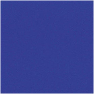
Where Should I Use it? Blue in its primary shade is perfect for use in the bathroom, study, and bedroom. The Bathroom is definitely the number one destination where blue is found.
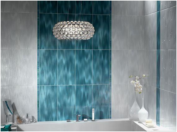
Blue looks fantastic with chrome and white, which is why it works so well in the bathroom – that and it’s obvious resemblance to water! If you want to make a statement with your interior design, cover your walls and floor with the same shade of blue.
Alternatively use it as an accent; blue is a deep, dramatic shade therefore it will create a subtle statement in your home. Using just a small snippet of blue can make all the difference in your home and breathe fresh life into your interior design!
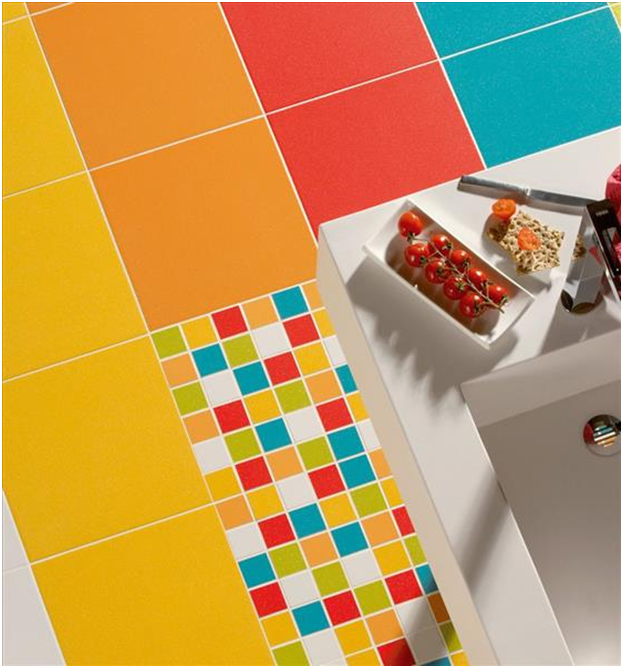
Yellow

Where Should I Use it? Yellow is warm and welcoming, it is a fantastic colour to use in the kitchen and hallway. It will give your home and all year round summer feeling!
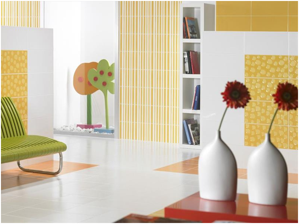
Yellow is charming, especially when used together with white it adds a wonderful warm element to interior design and is perfect for the family home. Many different colours contrast wonderfully and complement yellow beautifully making it wonderfully versatile.
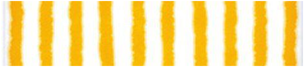
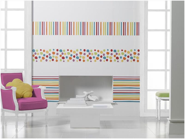
This year stripes are definitely a must-have when it comes to redecorating your home, and what’s great about stripes? They don’t go out of fashion! Stripes are simple, yet sophisticated which will add an air of excitement to your home.
Red

Where Should I Use It? Red is a statement shade and looks fabulous in the bathroom, kitchen, and dining room. We don’t recommend this in the study though, red does not aid concentration!
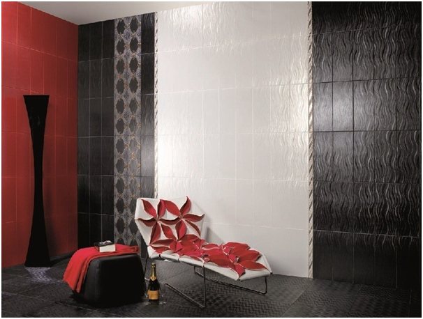
As an accent, red looks simply divine, especially when creatively contrasted with black and white. Monochrome, really brings red to life and looks exquisitely classy whilst doing so; it will surely add a sense of luxury to your home.
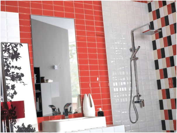
Use to zone different elements such as the shower area or sink area in your bathroom. It is incredibly contemporary and will certainly impressive any house guests that you have! Suave, chic and marvellously modern, red is definitely a wonderful colour for the bathroom!
All Together
If you love all three primary colours, then you’ll be happy to know that you don’t have to make a decision. All three colours look fantastic together; simply use them as accents against white, cream or black interior. To make things really interesting, try adding varying shades of each primary colour. There is one simple rule: Don’t be afraid of colour!
So if you’re looking to create contemporary home design with a touch of va va voom, then choose primary colours! They look absolutely incredible and will certainly wake you up in the morning! For advice or further information in regards to our products here at Tile Mart, please do not hesitate to get in contact. We are more than happy to help and have a vast knowledge about all of the products that we stock.